
Oxfam Infographic
This project involved designing an infographic for Oxfam that explained the different levels of food security with data. The aim was to break down the data into a clear and informative infographic that could be understood at a glance. The infographic needed to clearly define each stage of food insecurity, present facts and figures, and appeal to a wide audience.
Project Type: Infographic Design & Data Visualization
My Role: Graphic Desinger
Tools: Adobe Illustrator, Figma, Photoshop
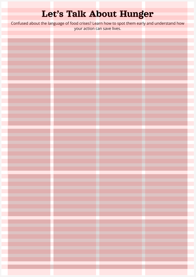
Lo-fi wireframe created in Figma

Final Poster with created in Figma - individual icons created in Adobe Illustrator
The data and copy was provided, my role was to present it in a visually appealing format so as to communicate the facts and figures in an impactful manner. I started by sketching out some initial layout ideas and then finalised my layout with a low fidelity wireframe on Figma. I used a layout grid and utilised holding information in frames to ensure visual consistency. I selected a gradient from green to red to communicate urgency, and created custom icons to symbolise the different facts presented and create cohesion between the different stages.
The final design clearly defines each stage of food insecurity and communicates the purpose of the data through a recognisable colour scheme and simple graphic icons. This project highlighted how visual design can increase awareness of complex issues. By presenting the facts in a structured and digestible way, the infographic makes the severity of food insecurity more understandable and actionable.